导语:
本文用格式工厂中软件、视频录制软件录制。音画中视频采用了遮罩代码导入小视频,也同时导入花样字幕等,同步朗读做lrc相比较歌曲更难,同时在一个画面中导入几个代码,做音画定位相当难,我未有信心尝试。我现在只在Dreamweaver中编辑后,在自己电脑中录频上传至美篇网,这样可以保存视频。
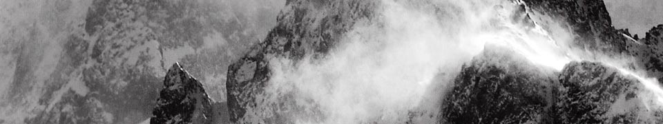
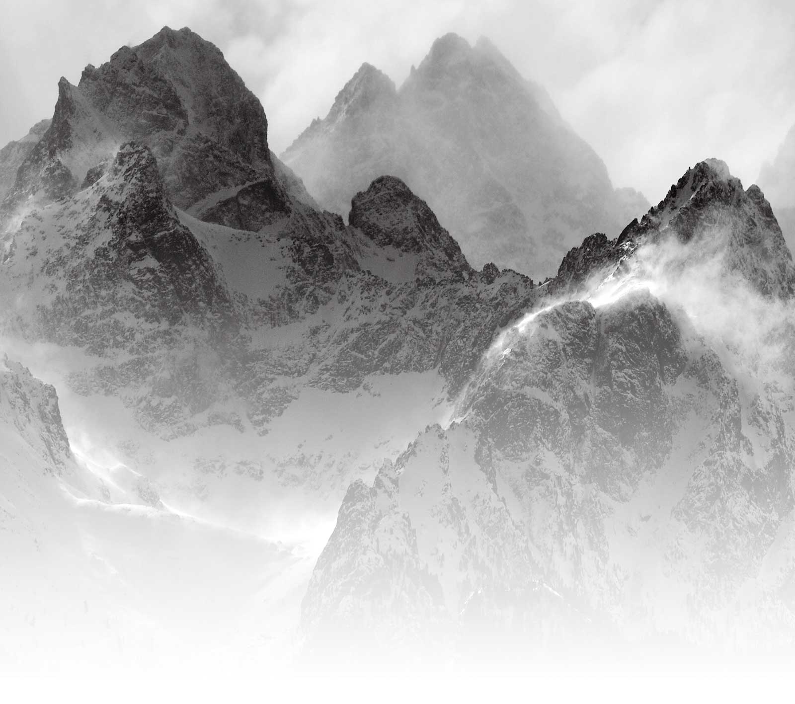
春天,遂想起
代码如下:
<div class="pct"> <style type="text/css"> .pcb{margin-right:0} </style> <div class="pcb"> <div class="t_fsz"> <table align="center"> <tr> <td class="t_f" id="postmessage_9363780"><div style="WIDTH: 1150px; POSITION: relative;left: -200px; TOP: -50px;"> <div style="width:1064px;height:730px;background-image:url(http://www.keai99.com/data/attachment/forum/202008/08/155508ittse05ah1lq1qa1.jpg); overflow:hidden;border-radius:5%;position:relative;border:thick brown ridge;left:310px;top:100px;margin-bottom:120px;background-size:cover;"> <img style="WIDTH: 1125px; HEIGHT: 730px"
src="https://p3-tt.byteimg.com/origin/pgc-image/c7331bb0be824374b962b5231536d10e?from=pc" > <div style="MARGIN-TOP: -550px; MARGIN-LEFT: -480px"> <style type="text/css"> .html{ top:10px; left:-20px; width: 1000px; height: 830px; background-size: cover; transform-origin: center;position: relative; } @keyframes slider01{ 0%{background: linear-gradient(20deg, #008000, #ff0000, #23a6d5, #000090);} 25%{background: linear-gradient(60deg, #000080, #ff0000, #23a6d5, #fff000);} 50%{background: linear-gradient(90deg, #ee7752, #008000, #23a6d5, #00ff00);} 75%{background: linear-gradient(-80deg, #800080, #ff0000, #23a6d5, #000090);} 100%{background: linear-gradient(-90deg, #000089, #ff0000, #800080, #ffff00);}} .book{ position: absolute; top:240px; left:57%; transform: rotatez(20deg) rotateX(25deg); } /*页面倾角*/ .书页 { position: absolute; width: 210px; height: 190px; border: 8px solid #689A06; text-align: center; background-color: #cccccc; } /*绝对定位;页面宽高;边框线厚度,样式,颜色;页面居中;页面背景色*/ .书页 p{ font-size: 30px; color: #fff; margin: 10px; } /*页面上的文字属性;外边矩*/ .封面 p{ font-size: 40px; font-weight:bold; color: #fff; margin-top: 10px; } /*封面上的文字属性;外边距*/ .flip-animation-0 { animation: flipBook0 120s 1s infinite normal;} /*封面动画*/ @keyframes flipBook0 { 0% { transform: rotateY(0deg); } 50% { transform: rotateY(-220deg); } 100% { transform: rotateY(0deg); } } .flip-animation-1 { animation: flipBook1 120s 5s infinite normal; } /*第一页动画*/ @keyframes flipBook1{ 0% { transform: rotateY(0deg); } 50% { transform: rotateY(-220deg); } 100% { transform: rotateY(0deg); } } .flip-animation-2 { animation: flipBook2 115s 10s infinite normal; } /*第二页动画*/ @keyframes flipBook2 { 0% { transform: rotateY(0deg); } 50% { transform: rotateY(-210deg); } 100% { transform: rotateY(0deg); } } .flip-animation-3 { animation: flipBook3 110s 15s infinite normal; } /*第三页动画*/ @keyframes flipBook3 { 0% { transform: rotateY(0deg); } 50% { transform: rotateY(-210deg); } 100% { transform: rotateY(0deg); } } .flip-animation-4 { animation: flipBook4 105s 20s infinite normal; } /*第四页动画*/ @keyframes flipBook4 { 0% { transform: rotateY(0deg); } 50% { transform: rotateY(-200deg); } 100% { transform: rotateY(0deg); } } .flip-animation-5 { animation: flipBook5 100s 25s infinite normal; } /*第五页动画*/ @keyframes flipBook5 { 0% { transform: rotateY(0deg); } 50% { transform: rotateY(-200deg); } 100% { transform: rotateY(0deg); } } .flip-animation-6 { animation: flipBook6 95s 30s infinite normal; } /*第六页动画*/ @keyframes flipBook6 { 0% { transform: rotateY(0deg); } 50% { transform: rotateY(-190deg); } 100% { transform: rotateY(0deg); } } .flip-animation-7 { animation: flipBook7 90s 35s infinite normal; } /*第七页动画*/ @keyframes flipBook7 { 0% { transform: rotateY(0deg); } 50% { transform: rotateY(-170deg); } 100% { transform: rotateY(0deg); } } .flip-animation-8 { animation: flipBook8 85s 40s infinite normal; } /*第八页动画*/ @keyframes flipBook8 { 0% { transform: rotateY(0deg); } 50% { transform: rotateY(-150deg); } 100% { transform: rotateY(0deg); } } .flip-animation-9 { animation: flipBook9 80s 45s infinite normal; } /*第九页动画*/ @keyframes flipBook9 { 0% { transform: rotateY(0deg); } 50% { transform: rotateY(-130deg); } 100% { transform: rotateY(0deg); } } .flip-animation-10 { animation: flipBook10 75s 50s infinite normal; } /*第十页动画*/ @keyframes flipBook10 { 0% { transform: rotateY(0deg); } 50% { transform: rotateY(-110deg); } 100% { transform: rotateY(0deg); } } .flip-animation-11 { animation: flipBook11 70s 55s infinite normal; } /*第十一页动画*/ @keyframes flipBook11 { 0% { transform: rotateY(0deg); } 50% { transform: rotateY(-90deg); } 100%{ transform: rotateY(0deg); } } .flip-animation-12 { animation: flipBook12 65s 60s infinite normal; } /*封底动画*/ @keyframes flipBook12 { 0% { transform: rotateY(0deg); } 50% { transform: rotateY(-10deg); } 100% { transform: rotateY(0deg); } } .preserve-3d{ transform-style: preserve-3d; } .point{ transform-origin: 0% 50%; }
.播放器 {TOP: 720px;LEFT: 50px; width: 870px; height: 100px; box-sizing: border-box; background-size: cover; animation: sliderx 10s linear infinite ; transform-origin: center;position: relative; opacity:1.9; } @keyframes sliderx{ 0%{transform:rotatex(0deg)} 50%{transform:rotatex(-360deg)scale(1.0)}100%{transform:rotatex(-360deg)}} </style> <div class="html"> <div class="book preserve-3d"> <div class="book-page-box"> <div class="书页"> <p><img src="http://p1.pstatp.com/large/pgc-image/1526199015599066a2b872c" style="width: 200px; height: 180px;" /></p> </div> </div> <div class="flip-animation-11 point"> <div class="书页"> <p><img src="http://p1.pstatp.com/large/pgc-image/1526199178912b40ecb7b3f" style="width: 200px; height: 180px;" /></p> </div> </div> <div class="flip-animation-10 point"> <div class="书页"> <p><img src="http://p3.pstatp.com/large/pgc-image/15261992254686b2a574781" style="width: 200px; height: 180px;" /></p> </div> </div> <div class="flip-animation-9 point"> <div class="书页"> <p><img src="http://p3.pstatp.com/large/pgc-image/15261992751942db1fbfb31" style="width: 200px; height: 180px;" /></p> </div> </div> <div class="flip-animation-8 point"> <div class="书页"> <p><img src="http://p3.pstatp.com/large/pgc-image/152619932008076827c5c00" style="width: 200px; height: 180px;" /></p> </div> </div> <div class="flip-animation-7 point"> <div class="书页"> <p><img src="http://p1.pstatp.com/large/pgc-image/15261993355920cb2467c41" style="width: 200px; height: 180px;" /></p> </div> </div> <div class="flip-animation-6 point"> <div class="书页"> <p><img src="http://p3.pstatp.com/large/pgc-image/1526199344172a548083d7f" style="width: 200px; height: 180px;" /></p> </div> </div> <div class="flip-animation-5 point"> <div class="书页"> <p><img src="http://p1.pstatp.com/large/pgc-image/1526199354469179a67e02c" style="width: 200px; height: 180px;" /></p> </div> </div> <div class="flip-animation-4 point"> <div class="书页"> <p><img src="http://p3.pstatp.com/large/pgc-image/1526199363928b7ba1846e6" style="width: 200px; height: 180px;" /></p> </div> </div> <div class="flip-animation-3 point"> <div class="书页"> <p><img src="http://p3.pstatp.com/large/pgc-image/1526199377305d3ae0b6169" style="width: 200px; height: 180px;" /></p> </div> </div> <div class="flip-animation-2 point"> <div class="书页"> <p><img src="http://p3.pstatp.com/large/pgc-image/152619938596464c58aa1b3" style="width: 200px; height: 180px;" /></p> </div> </div> <div class="flip-animation-1 point"> <div class="书页"> <p><img src="https://p1-tt.byteimg.com/origin/pgc-image/d21300a1838e4e89a9ad91b2ca669f58?from=pc" style="width: 200px; height: 180px;" /></p> </div> </div> <div class="flip-animation-0 point"> <div class="书页"> <p><img src="https://p3-tt.byteimg.com/origin/pgc-image/02aadd7c56ed4915bcfefb5d602bc3ab?from=pc" style="width: 200px; height: 180px;" /></p> </div> </div> </div> </div> </div> <div style="MARGIN-TOP:-600px"> <style type="text/css"> .移 { display: block; margin: 0px 60px; position: relative; animation: spin 10s linear infinite; animation-delay: 3.5s;/*延迟时间*/ animation-iteration-count:infinite ;/*循环次数*/ animation-duration: 20s;/*歌词一个周期的持续时间*/
}
@keyframes spin {
-0% { transform: translate(2%,0%)scale(1.0)rotateX(0deg)rotateY(0deg);} 15% { transform: translate(-23%,0%)scale(1.0)rotateX(0deg)rotateY(0deg);} 35% { transform: translate(23%,0%)scale(1.0)rotateX(0deg)rotateY(0deg);} 55% { transform: translate(2%,0%)scale(1.0)rotateX(0deg)rotateY(0deg);}
75% { transform: translate(2%,-23%)scale(1.0)rotateX(0deg)rotateY(0deg);} 95% { transform: translate(2%,23%)scale(1.0)rotateX(0deg)rotateY(0deg);} } </style> <div class="移"> <div style="margin-top:-250px; margin-left:225px;"> <embed allownetworking="internal" allowscriptaccess="never" flashvars="mp3=
http://static.oldkids.com.cn/upload/2021/04/03/blog_260780434_20210403182905064.mp3&lrc=
[00:00.00]春天,遂想起 [00:04.44]文:余光中 [00:07.47]诵:晓玉 [00:23.25]春天,遂想起江南, [00:30.63]唐诗里的江南,九岁时 [00:36.46]采桑叶于其中, [00:38.94]捉蜻蜓于其中 [00:42.52](可以从基隆港回去的) [00:46.34]江南 [00:50.63]小杜的江南 [00:53.40]苏小小的江南 [00:56.39]春天,遂想起江南, [00:59.49]遂想起多莲的湖, [01:00.80]多菱的湖 [01:01.87]多螃蟹的湖, [01:05.92]多湖的江南 [01:07.96]吴王和越王的小战场 [01:13.52](那场战争是够美的) [01:17.79]逃了西施 [01:19.38]失踪了范蠡 [01:21.29]失踪在酒旗招展的 [01:24.51](从松山飞 [01:25.97]三个小时就到的) [01:28.18]乾隆皇帝的江南 [01:32.72]春天,遂想起 [01:33.71]遍地垂柳的江南, [01:44.33]想起太湖滨一渔港, [01:48.96]想起 [01:51.75]那麼多的表妹, [01:54.30]走在柳堤 [01:55.35](我只能娶其中的一朵!) [01:58.55]走过柳堤, [02:01.78]那许多的表妹 [02:04.42]就那么任伊老了 [02:09.94]任伊老了,在江南 [02:15.47](喷射云三小时的江南) [02:19.94]即使见面, [02:22.47]她们也不会陪我 [02:25.78]陪我去采莲, [02:28.51]陪我去采菱 [02:31.50]即使见面, [02:34.53]见面在江南 [02:37.16]在杏花春雨的江南 [02:40.62]在江南的杏花村 [02:43.72](借问酒家何处) [02:46.60]何处有我的母亲 [02:57.57]复活节, [02:59.68]不复活的 [03:01.34]是我的母亲 [03:04.92]一个江南小女孩 [03:07.46]变成的母亲 [03:11.60]清明节, [03:13.57]母亲在喊我, [03:17.53]在圆通寺喊我, [03:21.14]在海峡这边喊我, [03:24.63]在海峡那边, [03:26.26]喊, [03:29.76]在江南,在江南, [03:33.94]多寺的江南, [03:37.61]多亭的江南, [03:40.21]多风筝的江南啊, [03:45.82]钟声里的江南 [03:48.85](站在基隆港, [03:51.60]想——想回也回不去的) [03:57.33]多燕子的江南 [04:07.51]本文结束 [04:11.88] [04:20.24]
&mp3b=http://play.tianshigege.com/sr3/musiclx/20121119/aaaxc20121120031244zky6myd5.mp3&gczt=微软雅黑&gczh=50&gcys=fff000&gczzys=ff0000&gcljys=000000&gcljld=1.0&gcct=1" height="200" invokeurls="false" quality="high" src="http://dashan.link/zj/dqyhgczz.swf" style="height: 200px; width: 550px; opacity:1.00;" type="application/x-shockwave-flash" width="550" wmode="transparent"> </div> </div> </div> </div> </div></td> </tr> </table> <table style="MARGIN-TOP: -800px; MARGIN-LEFT:1200px" width="300" height="180"> <tr> <td><style> .mask{ width: 450px; height: 300px; -webkit-mask: url(https://p1-tt.byteimg.com/origin/pgc-image/5ecd8a96f66b45c3abbeb8de1dd57f07?from=pc);/* 你的形状模板地址,实体部分是显示的,缕空是不显示的*/ -webkit-mask-size: 100%; -webkit-mask-repeat: no-repeat; } .mask video{ height: 120%; width: 100%; } </style> <div class="mask"> <video autoplay controls loop muted src="http://url.amp3a.com/youku.php/XMzU5MzE5MTAwNA==.mp4" style="max-width: 100%; height: auto;"> </video> </div></td> </tr> </table> </div> </div> </div>
您需要登录后才能回复
登录立即注册
请选择你想添加的收藏夹
收藏夹名称


